Mirror E-Commerce Site
Problem
Mirror’s customers state they want the convenience of an e-commerce site and have been requesting it for years.
If customers cannot find their size in-store they buy clothes online from other retailers.
Remainder inventory with only a few pieces left is hard to move in stores.
Background
In 1994 Mirror opened its doors as a clothing store targeting budget-minded individuals. They provide cheap and fairly good quality clothing for any occasion. Mirror now has over 400 stores around the world in 32 countries, but they have yet to invest in an e-commerce website.
Solution
Design a logo for the company that is modern and neutral enough to attract all types of people and styles.
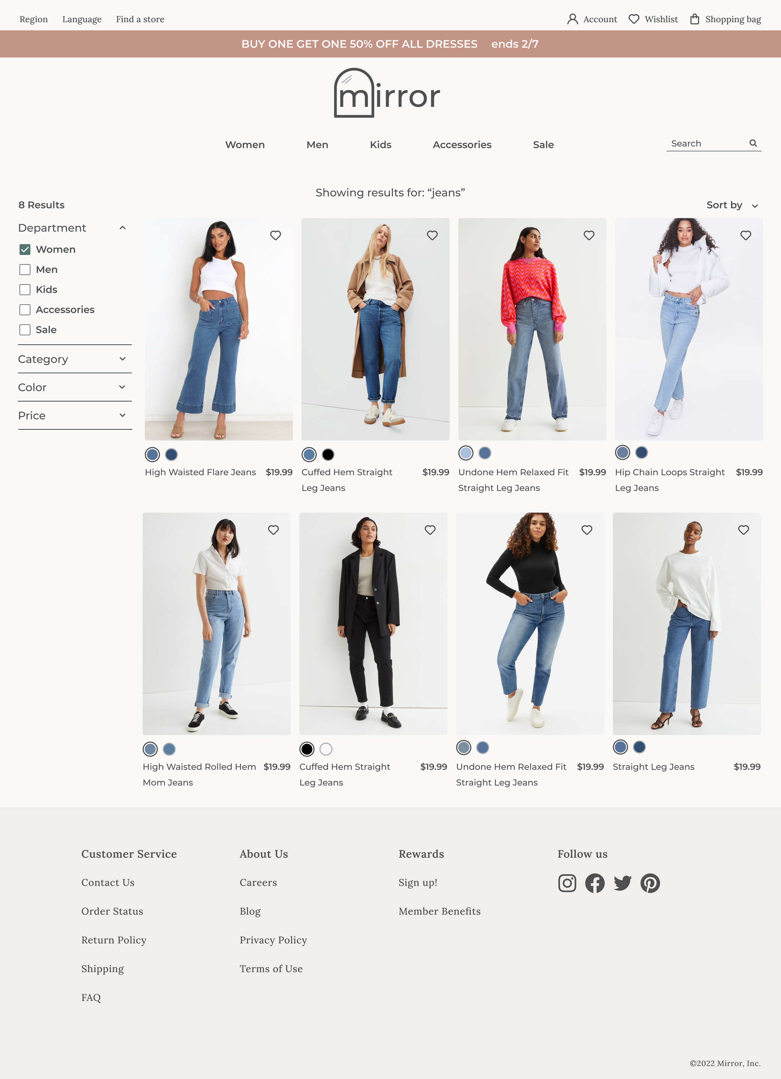
Design a responsive e-commerce website that is easy to use and that allows customers to browse through all products and filter by size, color, style, and others.
Build a prototype to test for usability
Research
Research Goal -
To discover what current customers value about the Mirror brand and shopping experience. To find out what online shoppers value in an e-commerce site so that Mirror can create an e-commerce site that meets all users' needs.
Methodologies -
Competitive analysis to see what features competitors offer on their e-commerce sites.
User interviews to hear firsthand how and why people shop online and/or in-store.
Deliverables -
User Persona: to direct all future design decisions
User Empathy Map: to further understand the user and their needs
Competitive Analysis
Market Research
Mirror’s competitors seem to fall into the category of fast fashion. This industry has a very low barrier to entry and is rapidly expanding creating more competitors.
H&M is the best example of having all important criteria for shoppers; good quality, multiple sizing options, and a variety of styles and types of clothes.
Brand loyalty is decreasing as online shopping increases. Customers are becoming more brand versatile as shopping online becomes increasingly convenient.
See full Competitive Analysis here
User Interviews
I conducted user interviews to learn why, when, and how users shop for clothing online.
Participants:
Number of participants: 3
Age range: 31-42
Number of children: 0-4
Location: Utah and Idaho
Marital Status: 1 single, 2 married
Occupations: Event and Catering Sales Manager, Homemaker, and Financial Consultant
Key Findings:
All participants cite convenience as the major benefit of online shopping.
2 of 3 participants value having personal information saved for faster checkout.
All participants fear the fabric quality, construction quality, and fit won’t meet their standards when shopping online
2 of 3 participants prefer to use the search feature over the category menu to find specific items
User Persona
Meticulous Melissa
Bio Melissa lives in the suburbs of Boise, Idaho with her husband and their 4 children. Her husband is in the process of expanding his business, while Melissa spends her time on DIY building projects around the house and taking care of the kids. The little time she has to herself she spends reading or planning more projects. Being so busy means she has to plan out her errands for when she won’t have any kids. Any errands are done while toting the kids around take 3 times as long and are noticeably less successful. She shops for clothing almost exclusively online so she can multi-task at home. Her own wardrobe has not been updated in years and she is finally searching for versatile pieces for staying home and going out to replace her current options.
Empathy Map
Define
Feature Roadmap
In order to account for every feature the user will need on this e-commerce site, I created a feature roadmap and sorted it by importance/necessity. Here are some examples:
Account Creation - User registration, sign-in, and account page so the user can access purchase history, order tracking, manage returns, and checkout using the saved information.
Search functionality - Search all products using keywords and get relevant results.
Product photos - Photos of the product on and off a model showing multiple angles.
Product Description - Description of the product including the material used, product features, potential uses, etc.
Card Sort
Research showed navigation and menu categories were critical for user satisfaction and success in online shopping. In order to make sure I was organizing the site in the most user-friendly way I performed a card sorting test. For this test, I listed various clothing items and had participants sort them into their own made-up categories. I learned users want gender categories and then types of clothing within gender. Occasions and styles of clothing can also be a subcategory.
Wireframes
Design
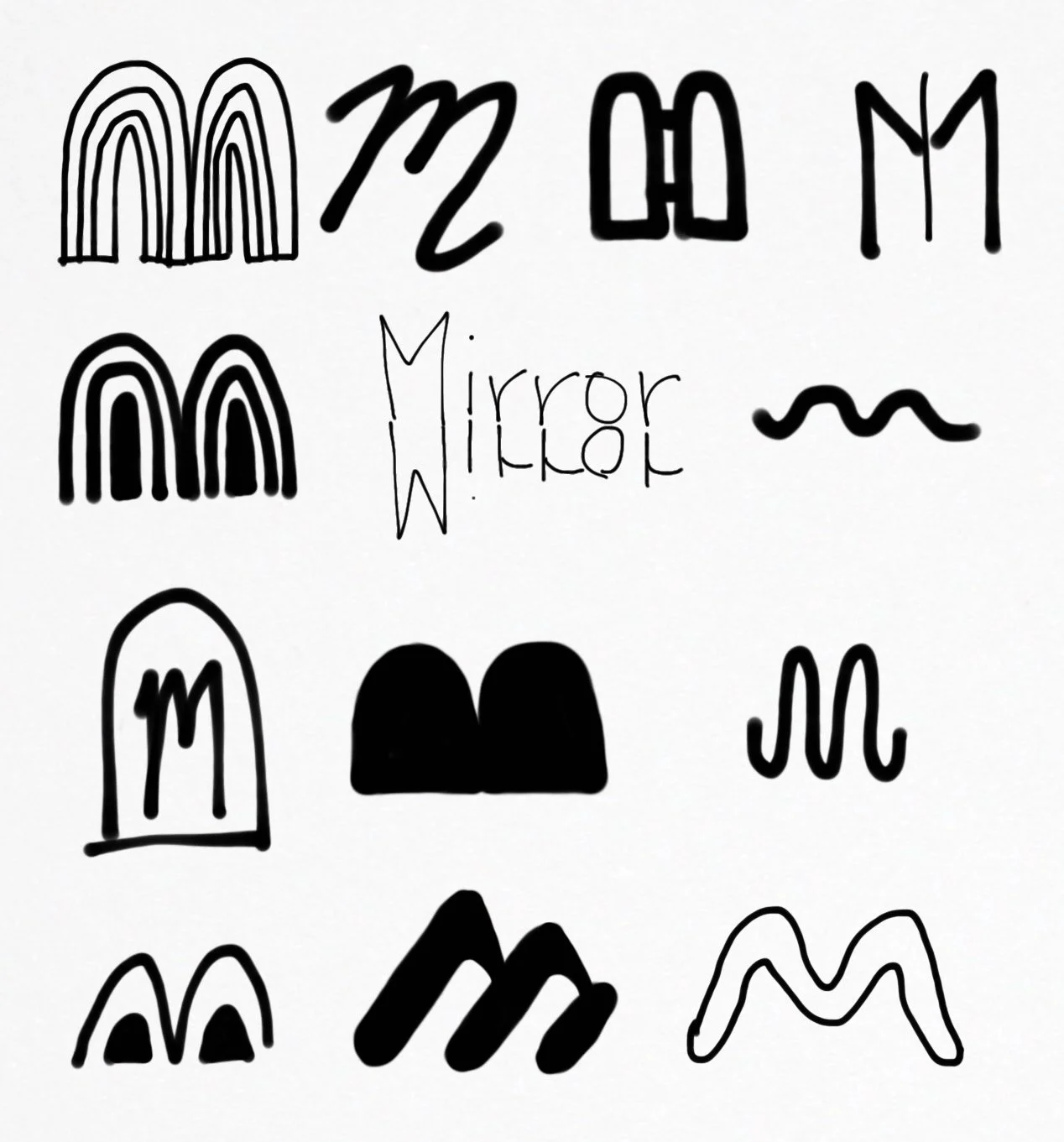
Before starting on the logo redesign and the visual design for the website I created a mood board based on these words: fresh, warm, playful, soft, approachable, and polished. Then, I started sketching and creating digital logos. After much consideration and tweaking, I settled on a logo and put together a style tile. Now that I had all my visual elements I designed some screens for the website.
Logo Sketches
Style Tile
High-Fidelity Screens
Testing
After visually designing all the screens needed to go through the user flow, I created a prototype and ran a usability test. Based on user feedback from the usability test I made 5 revisions.
Revision 1 - Finding Products
All participants tried to find the requested product via the category menu instead of the search bar. So, I created the drop-down category menu and updated the prototype to include both ways.
Revision 1 - Original
Revision 1 - Revised
Revision 2 - More Filtering Options
Two participants mentioned wanting more filtering options. One said they would like to filter by size so they don’t have to waste time by clicking on a product to find out if it is available in their size. Another participant mentioned style, but the style will be incorporated into the category filtering option once it is opened.
Revision 2 - Before
Revision 2 - After
Revision 3 - Product not fully visible within screen
Some of the participants mentioned having to scroll to see the entirety of the product photo on the product page. I resized the photo and product info card to better fit within a desktop screen.
Revision 3 - Before
Revision 3 - After
Revision 4 - Slide-in shopping bag
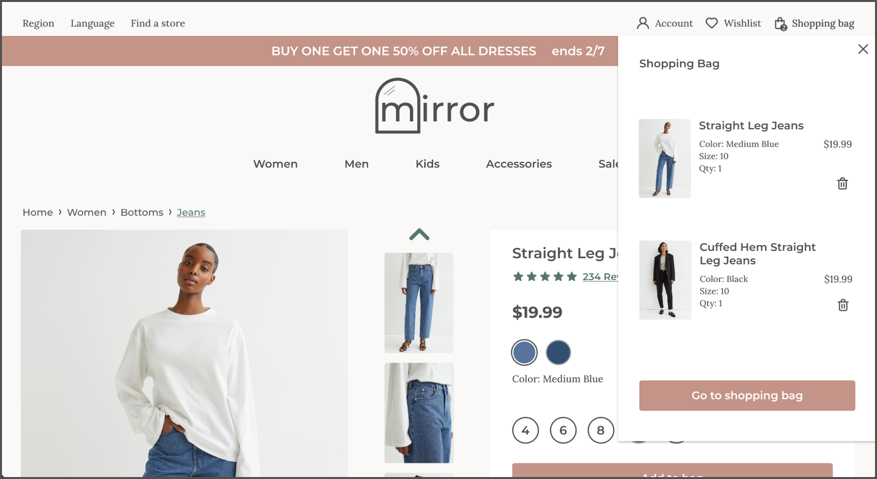
Two participants mentioned preferring a slide-in shopping bag instead of the pop-up. This way they can see everything in their bag instead of just one item and they can remove items if they accidentally added them or changed their mind. All of this is now possible without leaving the current page.
Revision 4 - Before
Revision 4 - After
Revision 5 - Sign-in or Checkout as Guest pop-up
Only one participant was confused about the original shopping bag and whether they could checkout as a guest, but two other participants mentioned they prefer a pop-up or a page where they can decide to sign in, create an account, or checkout as a guest.
Revision 5 - Before
Revision 5 - Shopping Bag After
Revision 5 - New pop-up before checkout screens
UI Kit
Prototype
Conclusion
What I would do differently
Focus competitive analysis on e-commerce sites and design features
Survey before further research methods
More participants in the research, specifically for the interviews
Observational testing because what users say they do is different than what they actually do
Refer back to research findings more often to guide design decisions
Next Steps
Retest prototype with revisions
Wireframe and design all screens needed for the site
Usability test again with different user flows and full prototype


