Tag It Screenshot App
Problem
People take screenshots on their phones of many different things; text conversations, recipes, products they want to buy, crafts they want to do, designs they are inspired by, etc. These screenshots frequently get lost in the mix of captured photos and can take up space without being utilized for their intended purpose. Since screenshots don’t capture a moment in time it can be very difficult to remember when they were taken and they might not be discoverable through a search on the built-in photos app of a phone.
Background
Screenshots typically have a different purpose than captured photos. People take photos to commemorate a moment in time so they can look back and more vividly remember experiences. They also can easily share experiences with friends, family, and their community through photos. A lot of the time screenshots are taken to inspire people to take action on something. For example, if I can easily find the recipe I remember screenshotting then I can buy the ingredients, make the meal, enjoy a new culinary experience, and feel satisfaction in completing this whole task. Solving the problem of forgotten screenshots will add value to people’s lives by helping them turn inspiration into reality.
Solution
Create an app to help users organize, find, and use the screenshots they take on their phones on a regular basis. Scope - Design a high-fidelity MVP in 80 hours.
Research
Research Goal -
To find out if users feel their current experience with taking and managing screenshots is deficient. Discover if and how they would like help managing their screenshots.
Methodologies -
Empathy Map: to brainstorm and define the potential users of this app
Competitive Analysis: to discover and analyze any direct competitors who are already trying to solve the same problem.
Survey: to understand users’ motivations for taking screenshots and their habits regarding taking and managing them.
Deliverables -
User Persona: to direct all future design decisions
User Journey Map: to discover necessary features and brainstorm additional helpful features.
Empathy Map
Competitive Analysis
Users are frustrated with how the built-in photos app and Google photos combine screenshots and captured photos in one place. These built-in photo apps and other photo organization apps have no management available specifically for screenshots. There are very few apps attempting to solve the problem of screenshot management so there is an opportunity to compete in the market. The top-rated app Screenshot PRO offers a lot of features and does a very good job overall, but they could be more user-friendly, have a more robust free version, and have fewer bugs/crashes. There is room for another app to enter the market and offer similar features in a different way and with a better free version.
Survey Results
I survey 29 people and the majority answered similarly to each other and to the assumptions I had before starting my research. Most of the participants were in the millennial age range, female, and college-educated. Results indicate participants want screenshots separated from captured photos and having the screenshots organized would be helpful to them. The majority of participants do take screenshots with the intention to look back at them later and find it difficult to do so. Also, none of the participants currently have an effective method for managing screenshots. These findings validate my assumptions and show that providing assistance in managing and organizing screenshots would solve a legitimate problem.
How easy or difficult do you find it to be to locate a specific screenshot on your phone?
Do you take screenshots with the intention to look at them again later?
User Persona
Influenceable Isabelle
Bio Isabelle is busy working as an Account Executive for a tech company in Silicon Slopes. She is organized and efficient at work, but she rarely has the time to set up systems to do this in her personal life. Isabelle would rather spend her free time keeping up with popular trends and trying new things. She really appreciates beauty but isn’t confident in her ability to create or curate beautiful things. She relies heavily on inspiration from professionals and influencers on social media to direct her creative efforts. She can’t afford to spend a lot of time and energy on organizing and finding screenshots of the things she wants to try.
User Journey Map
Running Influenceable Isabelle through the scenario below allowed me to confirm some of the features necessary for this app to function. It also helped me to come up with opportunities to make the user experience more robust by providing features that anticipate additional user needs.
Scenario: Isabelle is hosting a friends dinner and saw a cooking reel on Instagram that she wants to try. She screenshot multiple parts of the reel for her to reference when grocery shopping and making the meal.
Define
After the research phase and defining the user persona, I worked on defining the parameters of the app. In order to determine the necessary features for the app, I wrote user stories based on the user persona’s goals, needs, and pain points. Once the must-have features were identified I created a sitemap to determine the main screens needed for navigation. Next, I put the user persona through multiple task flows and turned them into user flows to account for different decisions the user might need to make during a task flow. With all the user flows created I knew all the screens that needed to be created and designed. This led to wireframing all the necessary screens so I could place features in a simple outline before adding the UI.
User Stories
Tutorial - As a new user, I want a tutorial so that I can quickly learn how to use the app.
Give photo authorization - As a new user, I want to give access to my photo library so that all my screenshots get imported.
Add tags on a photo - As a new user, I want to categorize my photos so that I can easily find them again later.
Add notes on a photo - As a new user, I want to add notes to a photo so that I can remind myself why I took the screenshot and what I want to do with it.
Sitemap
Task Flows
User Flows
Wireframes
Design
With the app structure defined and the screens outlined it was time to design the brand identity and all the user interface elements. After choosing a name and logo, I populated the wireframes with UI and screenshot examples to fully display how the app would look when functional. Then I put all the user interface elements into one document as a key piece of the design system.
Brand Identity
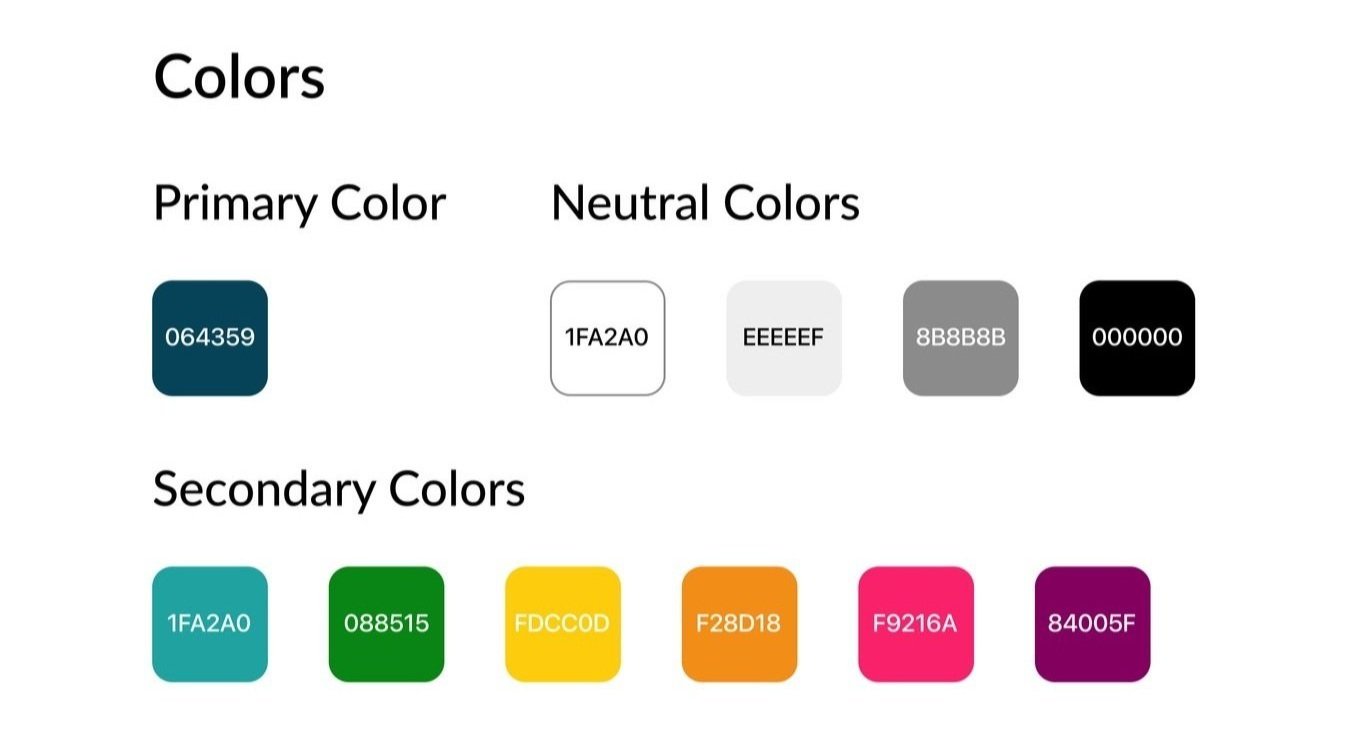
To represent the key functionality of the app, I decided to call the app ‘Tag It’ and designed a logo showing a tag on a screenshot. For the secondary colors, I wanted them to be bright and fun so they would stand out from whatever might be on an individual screenshot and help the user stay excited about all of their interests. As the primary color is shown more frequently throughout that app I chose a dark, but still vibrant blue because it has more contrast for higher readability and so it wouldn’t distract from the busyness of the multiple screenshots shown on almost every page. Dark blue is also a reassuring color that represents intelligence and calmness, which is how I want the user to feel as they embark on their endeavor to organize their ideas and try new things.
High-Fidelity Screens
Testing
Usability Testing
Once all the screens were fully designed I created a prototype and ran a usability test with it. I tested the prototype on 4 participants by giving them multiple tasks to complete with minimal instruction. All participants were able to complete the tasks without any errors, but they did give actionable verbal feedback.
Revisions
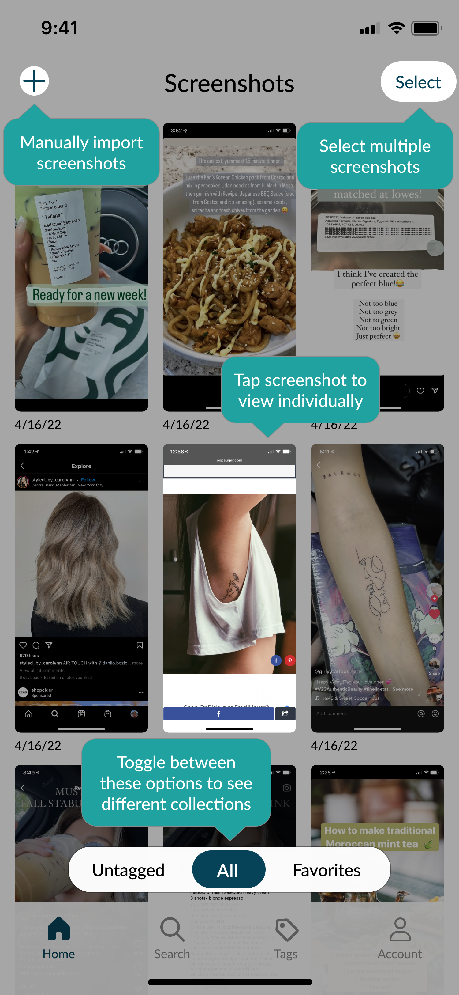
All of the participants commented on the length of the tutorial and thought they needed to touch the highlighted area in order to move on to the next step. In order to save time and effort, I consolidated tutorial blurbs onto the same screen as much as possible. This took the number of steps in the tutorial from 10 down to 4.
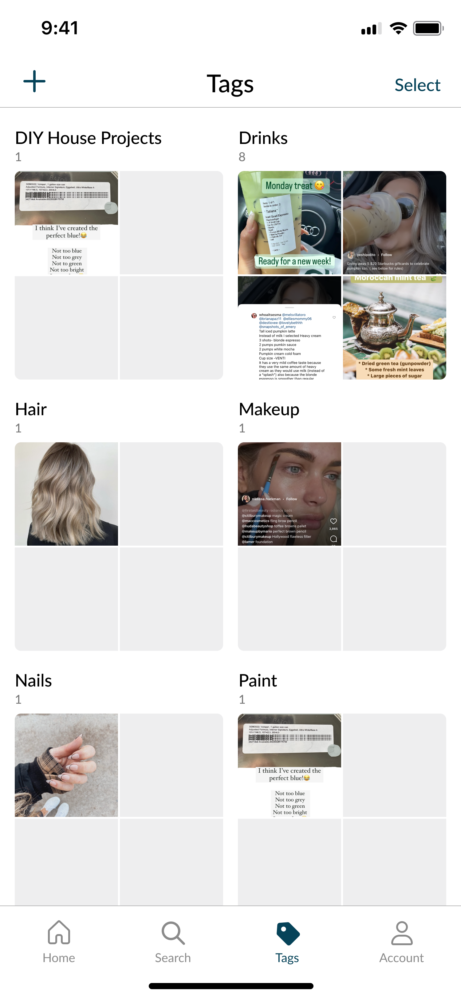
Some participants felt the feature to manage and delete duplicates was not visible enough on the Account screen. To remedy this, I added a Duplicates folder on the Tags screen next to the Recently Deleted folder. Both of these folders will be permanent on the Tags screen even if they are empty.
UI Kit
Prototype
Conclusion
The user research I conducted at the beginning of this project confirmed there is a need and a desire for help in organizing screenshots. Users are busy living their lives and organizing digital items can be time-consuming and tedious. My goal with this app was to make it robust, fun, and simple to use at the same time. There are multiple actions available to take on an individual screenshot, but the user can decide how much or how little they want to do. The results of this project culminating in testing the prototype are enough to show this app is worth developing, but I feel the true usability test would be once a user can import their own photos and add their own tags. Overall, this app solves a fairly universal problem by giving users the tools to emulate, accomplish, and share the things they are inspired by on their screens instead of forgetting about them.


